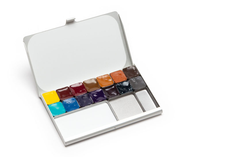
I’m happy to finally offer the Expeditionary Art Palette, filled with my favorite paints, now available in my Shop! These are the 14 colors that I most often reach for while sketching and painting, whether in the arctic or exploring around town. They are all Daniel Smith watercolors, which I’ve painted with since 1995. The paints are fantastic quality and I love that Daniel Smith is based in my home-town of Seattle.
The top row of this palette features my go-to warm colors, while the lower row includes cool colors, creating countless mixing possibilities. I’ve used this palette to paint around the world, from the arctic to the pacific northwest.
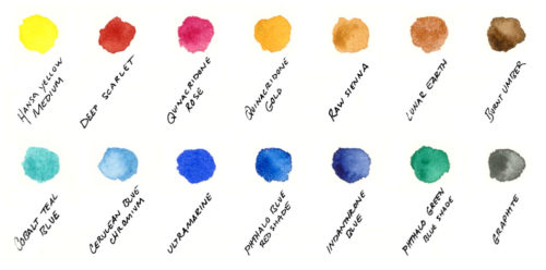
As a pure primary yellow, Hansa Yellow Medium is useful for mixing with any color. Deep Scarlet is my favorite red, a rich earthy tone that works beautifully with landscapes. Transparent Quinacridone Rose creates clean purples and is useful for sunset skies.
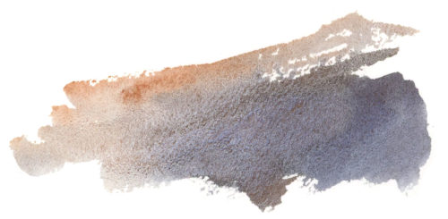
Each neutral brown has a purpose. Transparent Quinacridone gold creates luminous greens with any of the blues and green.
Semi-transparent Raw Sienna granulates and is part of my favorite set of colors for painting subtle grey landscapes (more on that below). Lunar Earth creates fantastic textures, and I enjoy Burnt Umber for mixing with blues for varied greys.
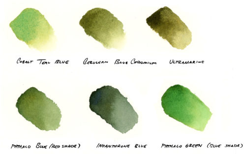
The second row of the palette includes cool colors. I love blues and managed to narrow this palette down to just five, varying from warm to cool and also varying in their opacity. Cobalt Teal Blue is a brilliant turquoise that can be washed into skies, tropical water, or highlight an iceberg’s edge. Cerulean Blue Chromium is a granulating sky blue that I often use in my paintings to create soft skies. On the warmer side, Ultramarine will mix rich purples, browns, and greys, creating textures as it dries.
Similar in hue to Ultramarine, but vastly different in properties is Phthalo Blue Red Shade. This transparent pigment is a near pure primary blue and mixes clean greens. I especially enjoy it mixed with Quinacridone Gold for foliage. Finally, Indanthrone Blue is a deep, warm, transparent blue and can create deep darks. The one green, Phthalo Green (blue shade) is a robust and transparent color, that when mixed with the red and rose creates deep greens and purples. I also love this color for painting the glow of icebergs. Finally, I’ve included a color I’ve just discovered: Graphite Gray! It dilutes into a beautiful textured grey and is opaque at high concentrations.
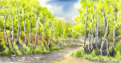
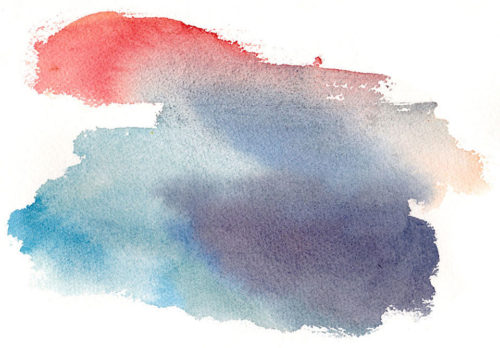
Working with a palette of just 3-5 colors can bring harmony to your paintings as your colors mixes are all related. You can read my suggestions for exploring limited palette choices, considering mood, light, and tone for your work. I also invite you to learn about my color choices for paintings such as Autumn Inspiration, Tabular Iceberg, Aspen Series, Storm Front.
Experiment, have fun, and please let me know if you have any questions!